


There is a little graph, which is updated daily, that I have been watching for a couple of months now. It seems that the northern hemisphere has not yet gotten the memo about global warming melting all the snow.
The snow was all meant to have gone by now and yet this year the snow mass is well above average.
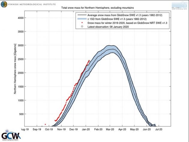
As you can see, the dotted line is the average snow mass for the years 1982-2012, the shaded area is ±1 standard deviation from the average and the red dots are the daily data for this northern hemisphere winter. Almost all of them above the one standard deviation line.
Note also the much earlier start with the dot in early October.
We know that “one swallow does not a summer make” but this clearly seems to be heading in the wrong direction from that predicted by the doomers.
With the sunspot cycle heading for a grand minimum, the future versions of this graph are going to be very interesting.