


In a recent post at WUWT, Thomas K. Bjorklund, University of Houston, Dept. of Earth and Atmospheric Sciences suggests that from 1850 to the present, the warming of the surface of the earth is less than 0.07 degrees C per decade which does not correlate with the rate of increase of CO2 into the atmosphere but is more likely to reflect 40 years of increasing intensities of the El Nino Southern Oscillation (ENSO) climate pattern.
Using one of the official temperature data sets with a long time series in order to compensate for short period fluctuations they calculated the temperature anomalies from the 1961 – 1990 baseline. This reduces location based effects from individual measurement stations.
What makes this analysis different is that instead of just looking at the anomalies and the trend in those anomalies, this study calculates the rate of change of the trend. (Otherwise known as the first derivative of the trendline.)
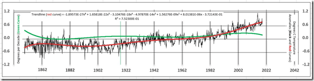
The green curve is a time-series of the month-to-month differences in mean surface temperatures in units of degrees Celsius change per month. These very small numbers are multiplied by 120 to convert the units to degrees per decade (left vertical axis of the graph). Degrees per decade is a measure of the rate at which the earth’s surface is cooling or warming.
In a recent talk, John Christy (May 8, 2019), director of the Earth System Science Center at the University of Alabama in Huntsville, reported estimates of noise-free earth warming in 1994 and 2017 of 0.09 and 0.095 degrees C per decade, respectively. The 2017 average value for the green curve is 0.154: this value is 0.059 degrees per decade higher than the UAH estimate. The latest value in August 2019 for the green curve is 0.125 degrees C per decade. The average degrees C per decade value of earth warming based on the green curve over 2,032 months since 1850 is 0.068 degrees C per decade. The average rate of warming from 1850 through 1979, to the beginning of the most recent El Nino Southern Oscillation (ENSO), is 0.038 degrees C per decade.
A warming rate of 0.038 degrees C per decade would need to significantly increase or decrease to support a prediction of a long-term change in the earth’s surface temperature. If the earth’s surface temperature increased continuously starting today at a rate of 0.038 degrees C per decade, in 100 years the increase in the earth’s temperature would be only 0.4 degrees C., which is not indicative of a global warming threat to humankind.
The 0.038 degrees C per decade estimate is likely beyond the accuracy of the temperature measurements from 1850 to 1979. Recent statistical analyses conclude that 95% uncertainties of global annual mean surface temperatures range between 0.05 degrees C to 0.15 degrees C over the past 140 years; that is, 95 measurements out 100 are expected to be within the range of uncertainty estimates (Lenssen, N. J. L., et al. 2019). Very little measurable warming of the surface of the earth has occurred from 1850 to 1979.
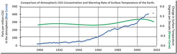
“So what about CO2 then?” Excellent question, Smithers! Let’s get rid of everything else except the green line and compare that to CO2 increases, as we all KNOW that CO2 is the evil culprit.
So what gives? And why is the green curve ‘S’ shaped? The author zooms in on the recent years that the global warming scam has been pushed and takes a closer look.
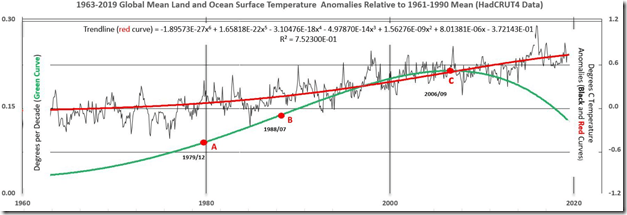
In Figure 3, the December 1979 temperature spike (Point A) is associated with a weak El Nino event. During the following 39 years, five strong to very strong intensity El Nino events are recorded; the last one, in 2015-2016, the highest intensity El Nino ever recorded (Goldengate Weather Services. (2019). The highest ever mean global monthly temperature anomaly of 1.111 degrees C was recorded in February 2016. Since then, monthly global temperature anomalies declined 35 percent to a temperature of 0.724 degrees C in August 2019 as the El Nino decreased in intensity.
Points A, B and C mark very significant changes in the shape of the green warming curve (values on left vertical axis).
1. The green curve values increased each month from 0.085 degrees C per decade in December 1979 (Point A) to 0.136 degrees C per decade in July 1988 (Point B); this is a 60 percent increase in rate of warming in nearly 9 years. The warming curve is concave upward. Point A marks a weak El Nino and the beginning of increasing ENSO intensity.
2. From July 1988 to September 2006, the rate of warming increased from 0.136 degrees C per decade to 0.211 degrees per decade (Point C); this is a 55 percent increase in 18 years but about one-half the total rate of the previous 9 years because of a decrease in the rate of increase each month. The July 1988 point on the x-axis is an inflexion point at which the warming curve becomes concave downward.
3. September 2006 (Point C) marks a very strong El Nino and the peak of the nearly 40-year ENSO transient warming trend, imparting a lazy S shape to the green curve. The rate of warming has declined every month since peaking at 0.211 degrees per decade in September 2006 to 0.125 in August 2019; this is a 41 percent decrease in 13 years.
But, hey – enough of this factual nonsense. Let’s zero carbon ourselves to save the planet.